Showing posts with label Art and culture. Show all posts

The Deep Field Paradox


Normally, objects that are further away look smaller. That is the basic rule of perspective. Without this rule, everything would be infinitely large right in front of us and we wouldn't be able to see anything. So, thank you, perspective. In outer space, however, if we look deep enough, objects start to look larger than they should, as if they are closer. This is because the universe has been expanding, and early objects are seen at a time when the universe was much closer together. This phenomenon is rarely mentioned by astronomers in public forums and then only in passing, without much excitement. 

Maybe because I am a visual artist, I can't quite get over this notion. And, because I am a complete amateur when it comes to Astronomy, I am perhaps misunderstanding the situation, so, please correct me if this is the case. As far as I can tell however, from researching the published science, this is actually the case, or believed to be the case. I haven't come across any actual observations. Also, it can only be the case if the big bang theory turns out to be true. And, vice-versa, if the very distant objects do not look enlarged (yet fainter) the theories of the big bang and the expanding universe are challenged.

I came upon this notion when the first Hubble Deep Field images were published and raised in me some questions regarding the optics of the expanding universe. I call it the Deep Field paradox.

In 1995 NASA created an image called the Hubble Deep Field (HDF). It was made using hundreds of long exposures at different wavelengths. It shows a region of the sky the size of a grain of sand held at arm's length (see more analogues and superlatives at the end of this post) in the greatest detail ever, exposing extremely far away galaxies, at a very early time in the history of the universe. It is considered by many the greatest photograph ever taken. But, more importantly, the image was the first to show a density of galaxies in what was until then assumed to be an empty region of the sky, indicating that there are far more galaxies in the visible universe than we had known before. The patch of sky was selected to avoid interference from other closer objects. Several more images have been created since then, such as the Hubble Ultra Deep Field (HUDF), the (Extremely Deep Field Image (XDF), of the same regions, and with even greater enlargement, showing objects even further back in time. The Hubble Ultra Deep Field South focused on a similarly blank region in the southern hemisphere and showed that this density of galaxies is probably uniform in all directions.


Some of the objects in the image are seen at only a few hundred million years after the big bang, which is now believed to be close to 13.8 billion years ago. This ever increasing reach towards the temporal beginning of the universe, implies that we will eventually be able to see the big bang itself, because our technology keeps improving. While it is true that we will still see further back than at present, there is actually a limit, because there was a period, referred to as the dark ages, during which nothing was visible, where a kind of murky fog persisted. Once our telescopes reach that far back, visibility will stop (although we can already detect cosmic background radiation, and kind of indirect image of the big bang, or maybe not).

But the image still raised two questions for me, one of which turned out to be based on a misunderstanding, the other turned out to be a very strange paradox, which am still trying to fully understand.

The first question that I had regarding this image and the notion of the expanding universe is a common one and is often phrased as: “How can we see the early universe and the Big Bang? Shouldn’t the light have already passed us?” (By “us” I mean not us presently but the stuff that we are made of, our previous materials in the past.) If everything was so close together and nothing can expand faster than the speed of light shouldn't all that light and information have already gotten to us once before and then how can we now see it again?

This questioning logically follows several misunderstandings based on the simplifications and analogies of astronomers trying to explain the universe to us laymen. The explanation begins like this: The visible universe started out as a singularity, a point so small it was without dimension and then very rapidly expanded into a ball the size of (insert here golf ball, grapefruit, orange, etc) and into space many light years across. It is still expanding, though less rapidly. This narrative is factually correct, as far as the scientific consensus is concerned, but the language creates a lot of confusion. When the golf ball is mentioned (or some fruit) astronomers are talking about the very early size of the CURRENTLY VISIBLE universe and NOT (and this is key) the ENTIRE universe. By visible they mean observable, as in limited by time. (Sometimes, by observable they mean opposed to invisible to our eyes, as in infrared, or because it is dark energy or dark matter, but not here.) So imagine a kind of large “sphere of the visible” 13.7 billion years in temporal diameter in all directions, and shrink it down to a golf ball. The edges of the ball represent “then” what the outer visible edges are now.

But that sphere is not all there is. The universe goes on from there. And the universe “out there” on “the edge” is not any older or denser than around here, only in the image of it. So if we waited another billion years, the observable universe would be a billion light years “larger” or "further out," showing us even more. The same would happen if we could instantly transport to a place a billion light years away and looked out in the same direction that we travelled, we would see another billion light years further. So, the universe continues beyond the HUDF image, we just can't see it yet. This photograph, like any others that have gone and will go deeper, does not show “the edge” of the Universe, just a period close to the beginning of time (which is amazing enough).

How much more of the Universe is there? That is still being debated. It could be infinite, also known as flat, or finite and curved (like a saddle or a sphere but in higher dimensions). In either case it is much larger than what we can now observe.

Let's get back to the golf ball. At that moment in early expansion, there would be many more golf balls, possibly an infinite number of them, so it makes sense that we didn't already see all of the universe at that moment in time.

But this infinity still doesn't explain why we wouldn't have seen at least the inner edges of our golf ball at that time. The explanation for this requires the mentioning of the second misunderstanding regarding space time, which is the speed of light limitation. Early on (and still today) the universe expanded at much faster than the speed of light. But isn't this impossible? No. Light within space cannot travel faster than the speed of light, but space itself can. Space expands equally everywhere very slowly, but distances accumulate over distance, so the farthest away objects are receding much faster (relative to us) than the speed of light. The outer rim of the golf ball never had a chance to optically reach us THEN because space was expanding so much faster than light. It has reached us now in the form of those earliest galaxies. Why now? Because, by definition what reaches us now is the visible edge. What reaches us tomorrow is the – slightly larger – visible edge tomorrow. The answer to “Shouldn’t the light have already passed us?” is that space expansion was faster than light and yet the light eventually reaches us. For the objects whose light age is close to the age of the universe, it took that long to reach us. Imagine someone in a car that is driving away from you, and throws a ball towards you. Even if the car was very close to you at first, the ball would take a while longer to reach you because of the movement of the car.

These deep field objects are very far away because they are extremely redshifted. Redshift, the reddening of light waves, or expanding of all electromagnetic waves, is due to a distortion of space and its effect on light across space-time. Redshift, discovered by Edwin Hubble, is extremely important as a measure of the age of light, and therefore distance. But, the age of light (light years) as a measure of distance is a misleading concept in deep space. Light years indicate the distance travelled through space, which gets distorted at larger distances, and so no longer matches actual distances in time.

A typical quote that promotes the misunderstanding regarding time versus distance is from Time magazine online: “The XDF [Extreme Deep Field image] goes even farther [than the HDF image], capturing objects some 13.2 billion light-years away”. It doesn't. It captures light that is 13.2 billion light years old, which in turn tells us a lot about its distance, but that IS NOT its distance. Objects whose light is 13.2 billion light years old are 32.69 billion light years away NOW, because after they released their light, they moved away from us in the expansion of space.

With close-by objects the time distortion is a comfortable concept. We see the moon 1.5 seconds in the past. We see the sun 8 minutes ago. Mars, 20 minutes ago, the nearest other star, Proxima Centauri 4.2 years ago. But we see these objects at roughly their correct distance, according to conventional perspective and the relationship between the speed of light and distance. However, when we observe other galaxies, the great distances mean that we see things not only in the past, but at drastically wrong distances, because the subtle expansion of space accumulates exponentially and becomes a strong distortion.

This distance distortion, the fact that there is a discrepancy between the age of the light (in this case 13.2 billion years) and their present position (32.69 billion years away) is also not a difficult concept. Light takes time to travel so things are not where they used to be (and look very differently now).

But there is a third distortion, and this is the Deep Field paradox: some of the furthest away objects appear closer to us, and larger, than some of the closer objects. This violates the rules of basic perspective (farther appears smaller). It's a kind of telescoping near the edge of the visible. I suspected this early on while looking at the image, and this was my second, totally naive yet reasonable question: shouldn't objects from the earliest periods of space appear very close to us? Apparently they do.

I came across the first confirmation of my suspicion in this quote:

“In an expanding universe, we see the galaxies near the edge of the visible universe when they were very young nearly 14 billion years ago because it has taken the light nearly 14 billion years to reach us. However, the galaxies were not only young but they were also at that time much closer to us. The faintest galaxies visible with the Hubble Space Telescope were only a few billion light years from us when they emitted their light. This means that very distant galaxies look much larger than you would normally expect as if they were only about 2 or 3 billion light years from us (although they are also very very faint - see Luminosity Distance) [emphasis added].”   http://www.atlasoftheuniverse.com/redshift.html

The same object mentioned before, 13.2 billion light years in the past, was only 2.9861 billion light years away when it released that light, because back then space was much more condensed. Its image appears to us in a position much closer than its age in years would indicate, about 1/5th the distance. Its original distance to us i.e. its apparent size when the light left, is defined by astronomers in terms of its “angular size”. I think of it as “how close it appears”.

You can play around with astronomical distances at this great website, the Light Travel Time Converter: http://www.astro.ucla.edu/%7Ewright/DlttCalc.html  Just enter a number for light travel time in Gyr (billion years), click on flat (infinite universe), and the rest of the measurements appear. Its apparent distance, will be listed as angular size distance. Try any number between 0 and 13.72 (the age of the universe). Then try 13.7199 and .046. Notice that an object whose light is 13.7199 billion light years (Gly) light travel distance would appear as if it is only .0.045587 Gly (about 45.587 million light years), which is closer than than an object whose light is only .046 light years “away”, at 0.045924 Gly. 

So an object that is cosmologically very far away has a larger angular size than an equivalent object that is much closer. It appears closer, not because it IS, but because it WAS (when its light left.) The furthest objects gave off their light when closer to us, earlier on, when space was much more condensed, and so appear larger than others that are closer to us, but whose light left more recently. In theory, if we could actually see the foggy, murky space right after the big bang, the beginning of time itself, it should appear right in front of us. Maybe it does. 

When you add a value of 13.72 Gly, the time of the big bang, in the Light Travel Time Converter, you get a distance of 0. 

To illustrate the notion of enlarged distant objects, I made an image that shows an object as it would appear in a deep field image. Because galaxies not only change drastically in shape, but also in size and color over time, they do not make for the perfect familiar object in a demonstration. So instead I use an actor's face, someone famous and pictured for his entire life: Mickey Rooney (I could have just as well used Shirley Temple or Michael Jackson). Like galaxies, people look younger in older images. Each row represents copies of him from left to right at different cosmological distances, vertically increasing with successive distortions.

Row A: Five identical Mickey Rooneys
Row B: Five Mickey Rooneys each further back in time/space
Row C: With added perspective (they look smaller with distance)
Row D: With added red shift (they look redder with distance)
Row E: With added dimming (they look fainter with distance)
Row F: The Deep Field paradox (the farthest look much larger than they should)


And here's a simulation of a deep field image with many Mickey Rooneys at different distances.


Notes:

The big question responded to on askamathematician.
"The farther we see into the universe, the younger the objects we see. But if we could see the Big Bang, it would be right on top of us. Isn't this paradoxical?"

A list of the superlatives and oddities of the Hubble Ultra Deep Field.
• it took one week of imaging, so it is a very long exposure. This long exposure was necessary to collect enough light to see resolve the faintest galaxies.
• it shows the furthest away and oldest objects in the universe every captured (up to that time).
• it shows the universe as it was between 400 and 800 million years after the big bang, about 12.9 to 13.3 billion years ago. The current consensus for the age of the universe is 13.7 billion years.
• it looks like a picture of stars, but on closer inspection it is almost exclusively galaxies, over 10,000.
• the section of the sky pictured is: if you made 8 feet of drinking straws into one tube and looked through it at the sky, or 1/10 of the width of the full moon, or a the size of a tennis ball seen from 300 feet away, or a grain of sand held at arms length, or 24-millionth of the whole sky.
• this is not a crowded section or unusual section of the sky, it is dense with with galaxies like this in every direction
• many objects are warm in color; the redder they are, the older and further away they are, due to redshift. The objects are in actuality in the infrared spectrum and we can't see them without using infrared sensors.
• the farthest imaged objects are young galaxies, therefore smaller and less ordered.
• many galaxies shown are larger, brighter, or strangely distorted (see “face galaxy” http://msp.warwick.ac.uk/~cpr/paradigm/HUDF-2.pdf) than they should be because of gravitational lensing. This lensing, which acts like naturally occurring gravity-based telescopes, allows astronomers to see even “deeper” into space, by providing naturally occurring gravity-based telescopes. Because these “lenses” are irregular in shape, they can strangely distort and multiply objects. Multiple versions of the same objects can also be seen at different periods in their history.  
• all optical rules that apply to this image also apply to any other image, even with much closer objects, just less so.


SNL and the international comedy delay


Saturady Night Live is now being licensed, not just imitated, in other countries (see links): Japan, Korea, Spain, Italy, Brazil

Franchising of TV shows is nothing new, but with SNL the issue becomes whether a particular type of American humor, which is often ironic, political, and topical, can be exported or recreated. In all likelihood, only the format will be copied, while the humor will be the usual local one, but I hope some of the American style will establish itself.

Interestingly, Saturday NIght Live has only recently become known in much of the non-english speaking world. I know that in Germany, for example, most people I asked have never heard of SNL. I often have to explain that it is the most important satirical show on American television and that it has spawned many of the Hollywood stars that everyone there does know. SNL is not alone: stand up comedy, as well, has only recently come to Germany, where it is smoothly blending with what they call Kabarett, which can be extremely good. I often cringe, however, when I see the typical US style standup performance there it because it is so brazenly imitative (imagine ”Hey. How you doin’ Heidelberg?" translated in German) and many of the jokes seem merely lifted from US comedians, with the assumption that the locals won't find out. In time this situation will probably improve.

Also, believe it or not, Johnny Carson is practically unknown in Germany. This is probably different in Britain and The Netherlands, etc, where American shows are regularly shown without subtitles, but in Germany the local market is large enough that most shows are dubbed, and it would make little sense to dub Johnny Carson, Letterman or SNL. They did dub Seinfeld, which really doesn’t work very well. And, because they don’t know Carson, or Conan, or Letterman, someone like Harald Schmidt can get away with an amazingly shameless Letterman rip off (see clip starting at around 2:55).

So what has caused the delay of this kind of American comedy? I would guess that it is mostly a matter of language and market size. Obviously English speaking countries can simply air the American content. As a result, Australians and New Zealanders are extremely aware of US popular culture and its history. But, countries with a large enough local non-english speaking market like Germany and France tend to dub and thereby leave out humor-based shows because the jokes just don’t translate. Countries that are smaller, and generally more multi-lingual, like The Netherlands, Belgium, Switzerland, tend to air the shows in English and with or without subtitles. Another factor is the content. Sex and action and violence translate visually, which explains why Johnny Carson is much less known than David Hasselhof in Germany, and than Schwarzenegger internationally. The third factor may be the internet. In most countries it is now possible to go around the official Television lineup and view American television, but it takes a while for the older generations to adopt to this newer medium and for the younger generations to find out about older establishments (like Carson, Carlin, Bruce, Pryor, SNL).

This disparity of knowledge points to a few bumps in the image of globalized culture. On the one hand Americans who travel abroad are often surprised by locals who actually know more about the US than many Americans (on some subjects, see Jason Jones interview with Iranians), but this erroneously leads to the assumption that they know everything about the US. Instead, there is always the national “portfolio” of international culture. The local still exists. In part, it expresses itself in very unpredictable combinations of knowledge and ignorance of the foreign.

I hope the export of SNL goes well. Of all the products to be exported from the US, I would prefer humor to be one of them, because it can be very subversive, cynical, progressive.

Related:
List of American TV shows based on British TV shows
List of international standup comedians (click on the United States link to get a picture of the difference in pure quantity).
Germany voted the least funny, US the most.


Complete Camera Convergence

We are headed towards a point in technology where spaces are visually replicated in three dimensions in real time, transmitted, and viewed interactively. Photography as we know it, will be considered merely a mode of visually and temporally framing a multidimensionality, whether actual or modeled. It will be to representation, what today a freeze frame is to video. Currently, we still think of photography as a specific medium with its own culture and mode of production, that overlaps on the fringes with film, video, scanning, 3d imaging and mapping. Eventually, however, photography will be a consciously limited subcategory in the completely converged system of optic reproduction.

Imagine a typical (and inevitable) application: an athletic game (soccer or football) is taking place and viewers at home and in the stadium view a live broadcast. But they can see it in three dimensions, even have it displayed as a holographic object in front of them. They can also change its angle of view and its level of enlargement. The viewer can zoom in on a particular player, and watch the action from any angle, all in real time. What will be broadcast will not be a dimensionally limited sequence of images, but a real time 3d, camera-based model. The entire model will be stored locally by viewers, as it changes through time, and so any interaction with it remains open-ended. Even a recording of the event, will be accessible from all angles and points in time. Consequently replaying the event in a different speed or from a different angle will be a personal choice. Dimensionality will be democratized. Image framing will be democratized.

The actual recording will be done by video cameras, some stationary, some mobile, some crowd-sourced (any member of the audience with a camera can upload a particular angle). There may also be some form of 3d scanning using optical or other wavelengths as an additional way to measure distances and dimensionality. All data will be combined into a single model in motion and then broadcast.

It will likely have different resolutions in different areas, and some areas (such as niches or spaces out of view) will be missing altogether. I imagine there will be more sophisticated algorithms by then to fill in the unknown areas based on intelligent conjecture. We can also expect heavy use of augmented reality, the overlaying of graphics, texts, social media, since the model already contains geo-locational data for easy superimposition.

All this is inevitable because the necessary technologies already exist and the trends are pointing towards spatialisation. The only bottlenecks are processing speed and data bandwidths, as usual. If we can assume that technology will accelerate as before, then all the pieces are destined to merge, and probably fairly soon.

We are already getting used to some of these ideas in consumer cameras. Many cameras now can take both still and video images, each of which is still considered a distinct entity. A video frame is lower in resolution, so as to allow for faster capture. Better processors are doing away with that distinction. A video will be merely an image sequence; a photo will be a freeze-frame, technically speaking.

Photos are also becoming dimensional for consumers, with many cameras having built-in options for panoramas, which can be viewed as if they are surrounding spaces. Or they include two lenses allowing for 3d photo and video (with a single perspective 3d result, not yet virtual modeling of space).

3d recording and displaying is advancing rapidly, creating a renewed commercial “added-value” and a necessity for Hollywood, from what used to be a gimmicky fad. TV and phone 3d displays not requiring glasses are already on the market. Video holography is also progressing rapidly, but may need a little more time to break through the processing bottleneck.

Video games are usually lagging behind Hollywood productions in realism, but only because games require real-time rendering, while Hollywood can devote however long they need to render just a single frame. Usually, what took hours and days to render a few years ago, gets reduced down to a fraction of a second, and can then be applied to gaming.

Lagging behind further is the speed of input. Both films and video games use similar methods of input: mathematical modeling (synthesizing) or photography and live video that is mapped onto geometric surfaces. But photography is also used to create 3d models directly, instead of just becoming a surface. Using multiple cameras positioned optimally, software can interpolate dimensionality. This method is being used very effectively by NASA and other space programs to create models of outer space or surfaces of planets. The data is gathered very gradually by telescopes and satellites and then creatively and mathematically combined to create “fly-throughs” and landscape “photographs.” Apple's new (and beautiful but rather useless and comically flawed) 3d mapping app is using the same principles: photography as the generator of space, as opposed to merely the content of surfaces projected on mathematical models, which is how Google's 3d maps are produced. Eventually, the input and its recombination into models could be accelerated to the point of being live.

Notice how we have to use quotation marks to distinguish a rendered viewpoint from an “actual” photograph of a sequence. The veracity of a scientific, model-based photograph is actually not inferior, because the original data is from measurements. It is not a photograph of just a model, it is a photo of a model based on photographs (and other data). In many ways such an image contains more information, i.e. more “truth.” What is missing perhaps, is the original momentary intent, the conscious framing in time, the soul of the photographer. But even that could be argued about. As the latest images from the European space program show, there is such a thing as the soul of the “post–photographer.” He/she wasn’t at the location then, but has experienced it virtually and internally and been affected by it emotionally, and this results in images that also reveal humanity.

It seems the idea of photography will become something similar to what in film production is called the “director of photography." It will denote the framing in time and space, the design of the image, not a residue of the moment of being there, feeling it, and taking the shot. The latter notion of photography could become something not necessarily retrograde, but certainly specialized. Perhaps it will be called moment-based photography (momentography) or some such.

In the meantime it is worth considering what such a convergence could mean for historical documentation. We are already recording the present in ways that could one day be reconstructed to create spatial models. Just as we can colorize old black and white films, and turn traditional movies into 3d (up to a point), it will be easier in the future to render spaces from optical recordings. So, it is actually urgent that we think about how we record the present for posterity, to prepare it for the proper dimensioning by future historians.

links:
European Space Agency images of mars, composited from multiple images into models, then reframed
http://www.esa.int/esaMI/Mars_Express/SEMWF0474OD_1.html
http://www.esa.int/esa-mmg/mmg.pl?b=b&type=I&mission=Mars%20Express&start=1

Holographic video in development:
http://web.mit.edu/newsoffice/2011/video-holography-0124.html
http://www.youtube.com/watch?v=Y-P1zZAcPuw

Microsoft photosynth uses public images to create dimensional spaces/views of the original subjects
http://photosynth.net

Multi-View Stereo for Community Photo Collections
http://grail.cs.washington.edu/projects/mvscpc/

A brief history of modern life

Phase 1: Not doing everything yourself anymore:
Electricity, running hot water, the oven, the refrigerator, the supermarket, processed foods, the broker, the insurance company, the travel agent, the dating service, the government …

Phase 2: Not doing everything yourself anymore, while sitting down:
radio, television, the telephone, the automobile, the train, the airplane, the drive-through...

Phase 3: Doing everything yourself again, while sitting down:
Online-banking, -investing, -lobbying, -publishing, -travel planning, -reviewing, -defining, -mapping-shopping, -selling, -dating …

The law of geographic perspective

In physical perspective objects further away look smaller and closer together and are harder to distinguish. There is an equivalent in cultural geography that seems to follow the same principles. The law of geo-cultural perspective: cultures further away seem to be almost indistinguishable. Many can't quite tell the difference between the Germans and the Dutch, the Hutu and Tutsi, Peru and Ecuador, China and Korea, Vietnam and Cambodia, Australia and New Zealand, Sweden and Norway. Sicily is mistaken as Italian, Bavaria is mistaken as German. In the US, all northern European folklore is mixed up as Polka (see Lawrence Welk). To the rest of the world, the US seems as one country, one culture; internally it seems like a world so diverse and complex as to eclipse the importance of the rest of the world.

Internal complexity distracts people from curiosity about the rest of the world. External complexity is considered irritating. Lack of curiosity about and irritation concerning other countries is externally labeled as ignorance.

New York's secret: medium tall

Manhattan is the only urban space that has tall buildings and a very active street life, in the same areas.

This is what makes it a "great city" — not its overall size, age, or wealth, or its monuments or its power or geographic position.

Just about every other city in the world with an active street life has low-rise buildings (take any old-world or latin American city.) There are, by now, many cities with high-rise buildings and street culture, but their exciting pedestrian action is located elsewhere in town (San Francisco, Chicago, New Orleans, Mexico City, Buenos Aires, Singapore, Shanghai, Frankfurt, Paris, etc.).

In New York City alone, a vibrant street life is truly framed by tall buildings, some very tall, but most just "tall," short by local standards and very high by international standards (15 to 40 stories) as well as completely normal size buildings (1 to 6 stories). And there are lots of these large buildings — it's not just a small area. All of midtown, parts of uptown and even the Village, and certainly the Wall Street district have so many tall buildings that most of them are anonymous, no one notices them or their desperate attempts at signifying wealth and status by alluding to ancient Greece or Rome, and Venice, Paris and London. Any one of them alone could be the star structure of any smaller city in the US.

I would like to emphasize the importance of "medium tall," as opposed to "sky scraper." Sky scrapers do little for cities except as icons, and only if they work visually from afar. They have very little of what I call "bottom life, " that is the street life that takes places in front of and because of them. "Medium tall" buildings,  generate street life as effectively as any 19th century traditional building and are the secret to this exciting city, because there are many hundreds of them.

In Manhattan you are not just ON a street. You are IN a street, very much like in a medieval town. In New York, this social, vertical experience still exists, proportionally translated into our time. The tallness of structures doesn't seem to impede culture in New York. In every other city, as far as I know, the vibrancy of public space rapidly decreases in exact proportion to the height and modernity of its buildings. In New York, height actually creates social enthusiasm. In all other cities, height is felt as an expression of distance and arrogance.

But, in New York, too, the real cultural centers are in the shorter (older, nineteenth century) areas; so the pattern applies here as well, but less. New York's cultural ferment is so productive that it seems to elevate the high-rise zones, Wall Street and Midtown, to the point of being "alive" even at night.

I speculate that this may have to do with the fact that New York City has developed tall buildings — buildings that would require an elevator — much earlier than other cities. Height showed up in Manhattan before modernism (in the Bauhaus or internationalist sense). New York didn't just invent skyscrapers, it normalized "tallness" in the mixed-use urban environment. New Yorkers made tall buildings while people still knew how to create architecture that doesn't interrupt urban flow. New York had tall buildings with the sound of horses in the streets.

The obvious pattern is that the more a city contains nineteenth century (or earlier) construction, the more street life it has. New York is nineteenth century enough to be culturally functional while prospering in the twentieth century enough to maintain verticality.

Vernacular architecture, southern zone and northern zone compared

You see it most clearly in Italy, but also in any areas south of the Alps in Europe and eastward, along the Mediterranean to the Middle East and onwards to South Asia. You also see it south of the US border in the Americas: a continuous positive development in urban, vernacular architecture. Let's call this architectural area,  the "southern zone" for the sake of brevity. I'd like to compare it to the "northern zone" using central Germany for that, and central Italy for the southern zone, as examples. 

In the northern half of this divide, vernacular architecture has suffered a severe break as a result of the general influences of modernism and specifically the ideas of Bauhaus and its relatives, imitators, and inadvertent followers. There, building has become angular, industrial, grey and cold. The general reputation of "modern architecture" is that of emotional and functional sterility, mainly because of its northern zone incarnations. There, because of war or "urban renewal"  or rampant development destroyed enough of the old to build the new in massive quantities. This sterility is most acute with official, industrial, and corporate building but also in residential urban, even suburban building.

In Northern (Anglo) America this sterility in the vernacular style is coupled with a kind of chintziness, a cheapness of construction, intended for short term existence or quick turnaround within the real estate market. In Anglo America, the industrial aspect of modernism has been completely and uncritically absorbed, without the original revolutionary and aesthetic ideas, in part because it fit an already persistent no-frills, short-term, earth-is-merely-a-steppingstone mentality. In the US, place (and earthly life) is something you merely move through. Vernacular architecture is on the level of military barrack, a temporary station. Churches, farms, stores, homes are built as temporary warehouses, sometimes patched up a little with mass produced classicist decorations to add "class" or cozyness.

In the southern zone, too, there is some non-vernacular building which is horribly cold and detached, mostly because it involved architects who probably had their eye on high modernism, or because some state agency without public input. But the general landscape is not shaped by a few official buildings, but by the general trends in vernacular construction, which could range from completely self-built, to moderately professional building involving architects.

To put it very bluntly, the southern zone is much more beautiful, because humanity creates beauty there. In the north (with plenty of exceptions of course) the vernacular tends towards hideousness, enthusiastically. If you don't agree, go and compare central Mexico with the US Mid-west, or Havana with Jacksonville, or Naples with Duisburg. Latin America and latin Europe are much more beautiful than Anglo America and Northern Europe; that's a subjective assessment, of course, but I'm willing to defend it. If cleanliness and order are an important part of your aesthetic, then this relation would be reversed. I recently talked to someone in my home town, who advocated more organized intervention and rebuilding in some of the most delapidated but romantic aspects of the town. I mentioned my appreciation for Naples, where a certain casualness and collaborative aesthetic makes for overwhelming beauty, and my disdain for Germany's overly anxious modernization. He countered that Naples is a terrible example, because there the beaches are dirty and shameful. He sees things in terms of order and cleanliness, places in terms of economic activities (tourists bathing, for example), which to him signify responsibility and pride. He must have completely missed the Naples I enjoyed.

The built landscapes of the southern zone are mostly beautiful, joyous, rich in detail, full of life. Usually there is also grit (various layers of dirt due to less than perfect maintenance). In places like southern Italy you may add hanging laundry to the picture (a.k.a "life"). There is harmony between the individual building and the mass of buildings. Most importantly, there is harmony within the full range of historical periods. A 20th century building next to a 16th century building, despite stylistic differences, may look perfectly harmonious, as if the basics of human needs and collective taste have remained consistent.

In trying to understand this break – between the pre-modern and modern in the North and the lack of it in the South – I've looked at several possible culprits.

Protestantism's visual severity
The notion that protestants are against fun is an old cliché, so I won't dwell too much on it. The basic theory is that when protestants (Germans, Swiss, French, English, Dutch) protested the hegemony and decadence of the Catholic church they did away with imagery (iconoclasm) and decoration in their churches and buildings. The church responded with the counter reformation, making their churches even more fun and lascivious (the Baroque). Church buildings and the religions of rulers of course influence the culture of building greatly, so it makes sense that in protestant areas, the built environment is less joyous, indicating seriousness and solemnity. There have been many references to modernism being an extension of protestantism. So, it could be that the northern tendency to make the built environment look dreary is a subconscious imperative to be solemn, serious, but also in line with modernist fashion. The words to be feared in the north are "decorative" and "frivolous" (unseriös -  in German - literally un-serious) and superficial (being only on the surface, instead of being visibly structural  – an essential modernist notion). 

The north's greater degree of industrialization.
Northern England, Belgium, Northern France, Central Germany — these are the (European) areas of the industrial revolution. The built environment there is accustomed to being dominated by progress, instead of romanticism. In Northern Italy, the Po region is heavily industrialized as well, and is less pretty than the areas further south. It could be that the collective aesthetic is formed by whatever dominates politically and economically, in this case industry. As a result, vernacular structures end up as dreary as industrial ones. Maybe, the art of making things beautiful simply gets lost in the face of overwhelming context. An additional element is that industrial areas are often newer, historically, and so less layered in terms of human habitation, showing a shorter spectrum of architectural creativity, which in turn affects the creativity of the vernacular. Or is it that the same tendency to industrialize, to prioritize work and functionality, also lowers the emphasis on fun and frivolity?

World War II and the "break with the past".
The notion here is that any kind of pedestrian, non-academic architectural beauty is associated with the past and thus rejected. Even though the Hitler era lasted only 12 years, it is associated with all previous fraudulent nativism and local folklore, with the bourgeoisie, with conformism and primitive hierarchy and only gradual advances. Modernism advocated a rupture, a revolution, and resulted in "throwing out the baby with the bathwater", that is the traditions of the vernacular, popular, bottom-to-top approach. Architecture, as currently taught, and even the vernacular kind, is managed from the top of the hierarchy, from the architect or "builder," the craftsman merely executing the concept (see Mies van der Rohe). Any evidence of visual warmth or errant crafted detail became taboo in the North. Craftsmen have to pretend to be industrial, to be the tip of the pen. This didn't seem to have happened as much in areas less destroyed by and feeling less guilty about world war II (Italy has a less radical rejection of Mussolini, Spain an even less radical rejection of Franco). In the south, the entire building seems to be formed by its surrounding culture, not some trendy builder looking for attention through rupture, and conforms to the whole while also expressing an individuality.

Climate and color harmony: the use of warm "impure" colors.
Color preferences in Germany and Italy, and in the "northern zone" and the "southern zone" are completely different. In the northern zone, things are either too grey or too vibrant. Greyish hues are very mixed: there are all kinds of dreary reds and browns. Whites are pure white, colors are very bright, such as green, which is usually a weird lime green, reflecting the color of grass in all seasons. In northern Europe there is a lot of rain, and winters are mild, so grass and tree trunks remain green all year. In the south, grass ranges from olive to beige. When Germans think of color, they think of bright, pure colors, like those of flowers and fruit and grass. In the south, colors are part of an immense spectrum, and rarely "pure". Grey is simply another color on this spectrum. 
   
Or, to put it very simply: In the built environment of the south, colors are always part white and part black. A typical row of buildings will have hundreds of shades of red, yellow, blue, green, but always pastel with some patina. Colors are held back and mixed, and become completely compatible with each other. The southern color palette allows freedom of collage, because the colors are not pure (unlike a Mondrian painting, the epitome of modernism and protestantism). They stick to the rule: hues of equal value (intensity) and sufficient impurity (patina) can be mixed infinitely. Everyone involved seems to understand this principle in Italy, also in nearby countries, with decreasing consistency westward and eastward (countries of the Caribbean region have their own harmonic rules, using very bright colors). I am sympathetic to the argument that climate is very important here, that the color of the sea, the land, the air influence the collective aesthetic. Italy is sunny and hazy (colorful but muted), Germany is grey and bright (and evenly lit). The caribbean is colorful and clear (not hazy), etc. So, the climate creates a color context which is more or less subconsciously "matched" by human creations.

Modernism as a mask for fascism
A recent, excellent article in Der Spiegel discusses the intricacies of postwar construction in Germany, and makes the point that in West Germany Nazi architects were re-integrated into the work force and continued their rather cold aesthetic under the label of modernism and Bauhaus. This doesn't explain the ugliness in the rest of the northern zones, but makes an important link between fascism and modernism, which are usually presented as opposite directions. The standard notion of fascism as retrograde (traditional) and modernism as progressive is undermined by the point that modernism, mostly in architecture, has a fascist component. I prefer to think that architecture, as a client-financed or applied art which requires significant up-front monies is simply much more likely to aestheticize power, than other "freer" arts such as literature and the visual arts, which can afford to be more personal and counter-cultural.


"These architects were quick to pretend [deny] that they had absolutely anything to do with the bombastic architecture of the Nazis and their megalomaniacal ideology. After the war, Speer's architects hid behind Bauhaus, the modernist style initially developed by Walter Gropius and others before 1933. Because the Nazis had persecuted its followers, being associated with Bauhaus was good for one's career after the war -- and it allowed them to actively promote modernism free from historical ballast." 


Which if of these factors is more important, and are there more to consider? Below are some images taken in Naples, italy, and Duisburg, Germany. Both are busy working class cities, although Naples is not as industrial and Duisburg is much smaller. Duisburg, as part of the Ruhr District, is typical (maybe a caricature) of the dreariness that is common in Northern Europe, despite the fact that residents are so often immigrants from more southern parts of the world. Naples is typical of southern Italy's grit and beauty. The comparison isn't meant to be fair, rather I am trying to contrast representative examples of the difference between the North and South. Below are some snapshots I took on walks and from the car.

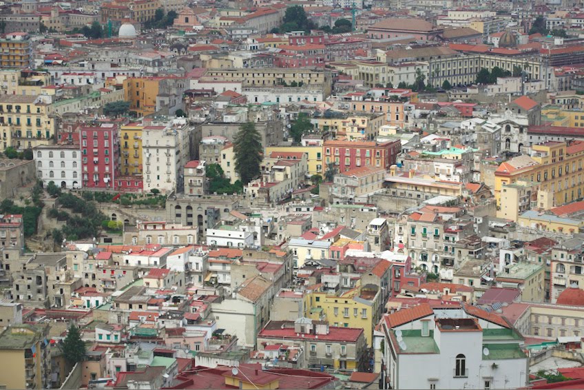
Far view of Naples. All colors fit together. None are too intense. All contain some white and black (or brown).

Naples street view: A modernist/internationalist building, (a building Darth Vader might love) on far right, dreary and hideous, but rare in Italy. Vernacular 20th century buildings in the center, full of life and warmth, and the usual 19th century building on the left, equally lively and warm. If you squint at both of the warm buildings you could notice that they average out to the same color, which is a muted yellow with both white and black infused.The newer building is just a little bolder in how the elemental colors are presented.

A very similar situation, only reversed left to right. Internationalist, 20th century, 19th century.
Another Naples street view. All are 20th century buildings, without the dreariness. Even the cars seem an integral part of the color composition.
Duisburg, Germany. Are they TRYING to be depressing? Are they trying to conform to the weather? What causes this?
More Duisburg. All colors are cold, all shapes are blocky.
Duisburg again. These are pre-modern, so there's at least some curvature allowed. Here they are trying to not be depressing in their choices of color, but they go to far. It's what's called "Farbenfroh", meaning "color happy". The colors are way to intense and primary, and there's no patina (exceptions are the light yellow and the brownish ones in the back). The buildings don't fit together, in terms of color, they need muting.
Duisburg; what I call provincial postmodern. Dreary, angular, psychopathic, non-functional. There is a lot of this in Germany (and in the Northern Zone) and it's baffling.